Candlestick chart patterns are among the most effective tools available to traders looking to get insights into the dynamics of the market in the world of financial markets. To interpret price action, traders utilize candlestick charts, which are essentially charts made up of individual candles. In this blog post, we will make you learn to read Candlestick Charts in easy ways and guarantee you that it will be worth reading this Post.
Also Read: Basics of Technical Analysis for Beginners
What are Candlestick Charts?
Fundamentally, a candlestick chart shows a financial asset’s price movement over a given time frame. The chart comprises individual “candlesticks” that, over time, build a pattern by displaying the opening, closing, high, and low prices for the market they represent each day.
The trader’s selected timeframe determines the period that each candle represents. The daily timeframe is a popular one, thus the candle will show the high, low, open, and closing times for the day. You can predict where the price might go by looking at the various components of a candle.
Anatomy of a Candlestick
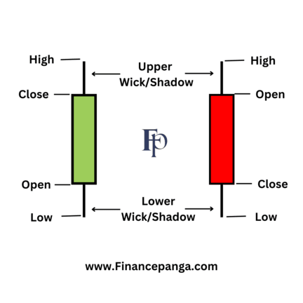
A Candlestick consists of a Body with its Open, High, Low, and Close as represented in the Image below. Note that there are two candles the green one indicates an uptrend which means the market price is going up and the red candle indicates a downtrend which means the market price is going down. However, these colors are default, You can change colors of your own choice.

Now Let’s understand the specific points from the above Image
- Open Price: The price that was traded at the beginning of the new candle’s development is shown by the open price. It is typically indicated by the starting point of the candlestick’s body. For example, if the open price of a stock is Rs 50 at the beginning of the trading day, the bottom of the candlestick’s body will start at Rs 50.
- High Price: The highest price traded during the period is shown by the top of the upper wick or shadow. For instance, if the price of the stock reached a high of Rs 55 during the trading day, the top of the candlestick’s upper wick will be at Rs 55.
- Low Price: The lowest price that was traded throughout the period is indicated by the lower wick’s or shadow’s bottom. If the stock’s price drops to a low of Rs 48 during the trading day, the bottom of the candlestick’s lower wick will be at Rs 48.
- Close Price: The close price is the final price at which the security is traded before the end of the period. It is represented by the ending point of the candlestick’s body. For example, if the stock closed at Rs 52 at the end of the trading day, the top of the candlestick’s body will be at Rs 52.
- The Wick: Also called “shadows,” the wicks represent the highest and lowest prices over a given charting period.
- Direction: The candlestick’s color indicates the direction of the price. If the price is heading upward the candle would be green because the closing price of the candle is higher than the opening price. If the Price is heading downward the candle would be red because the closing price of the candle is lower than the opening price.
- Range: A candle’s range is the difference between its Highest and lowest price; it may be computed as follows: Range = High Price – Low Price.
Also Read: Commonly Used Lingo in Stock Market for Beginners
Upshot
Candlestick charts are a useful tool for both novice and seasoned traders. You can obtain insight into the market mood and improve the quality of your trading decisions by learning the fundamentals of candlestick charts and popular patterns. You’ll have a deeper comprehension of candlestick analysis and its uses in your trading career as you study and practice more.


